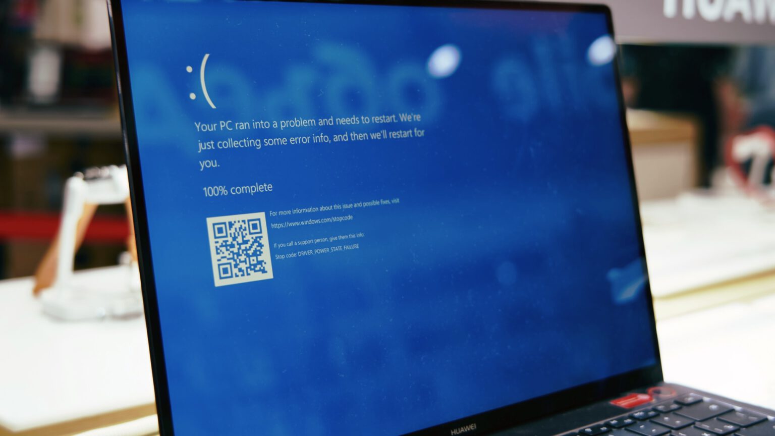
Microsoft has announced plans to redesign the familiar ‘Blue Screen of Death’ (BSOD) in Windows 11, considering changing its colour from the traditional blue to black. The new design aims to simplify the interface and better align with Windows 11 design principles, with changes including the removal of the sad smiley face and QR code, while retaining the technical information on the screen.
In test versions of the system for Windows Insider participants, the BSOD screen will temporarily be displayed in green. The final colour decision has not yet been officially confirmed by Microsoft.
The history of the BSOD dates back to Windows 3.0, where it served a diagnostic function for IT professionals. It has undergone several changes over the years, including the addition of a sad smiley face in Windows 8 and a QR code in Windows 10. In 2021, Microsoft experimented with a black BSOD background in test versions of Windows 11, but eventually reverted to blue.
The change in colour of the BSOD may raise mixed feelings among users and IT professionals, for whom the blue screen has become a recognisable symbol of critical system errors. On the one hand, the new design may fit better with the Windows 11 aesthetic and signal a refreshed approach to error communication. On the other hand, there is a risk that users accustomed to the traditional blue screen may initially feel confused.
In the context of Microsoft’s strategy, such a change may signal a move towards modernisation and unification of the user interface. However, the key will be to ensure that the new BSOD design does not adversely affect the ability of users and IT administrators to quickly diagnose and resolve system problems.
It is also worth noting that changes to such iconic elements of the operating system could be seen as a signal of a larger shift in Microsoft’s design philosophy, which could have further implications for future versions of Windows and other company products.


